At last! I have completed my final project in Professor Corrigan's Digital Arts class, Spring 2015 semester. In my opinion, this project was the perfect one to save for last. It was by far the most compelling and once completing it, it felt as if I was putting the cherry on top of a gigantic sundae that I have been adding numerous toppings to for months. I have come a long way in digital arts. There have been times when I got the hang of the programs and tools quickly (Illustrator) and other times that I would be biting my nails down, crying with frustration. But Professor Corrigan was generously always there, giving extra help whenever asked, and steering me in the right direction. For the animated commercial above, advertising Kat's Caddy, I feel most accomplished and proud of. I am shocked that I was able to create images, moving and hope I will be able to practice my newly learned skills from my Digital Arts class in the future.
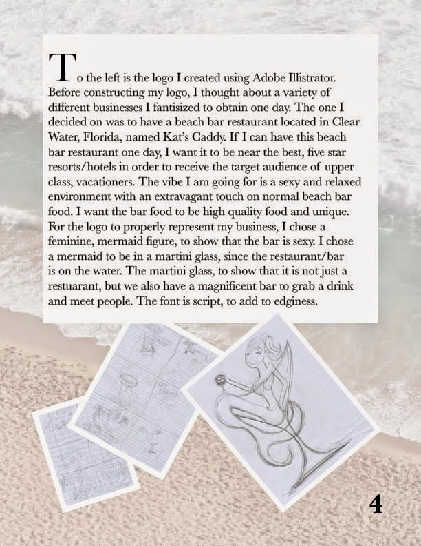
Kat's Caddy is a fantasy, elegant beach bar/restaurant I invented for one of the first assignments Professor Corrigan gave us. First, we had to imagine a business and explain what the business had to offer as if it actually existed. Next, we had to create a logo on Illustrator. To bring that project back to front and end the semester with it, I created an animated commercial advertising Kat's Caddy. For the video, I found multiple photos from the web and used photoshop to edit their hue/saturation and contrast and add additional text. Then, I set them out in a particular order that made most sense and added black fades in the beginning and end of every picture. In addition, I made it so the images moved by adjusting their position and timing, and changed the opacity to the text so it would fade in and out when images are changing to the next slide. As the video plays through, I also constructed it so the song "Banana Pancakes" by Jack Johnson in the background would play since I thought the song best fit the beach theme Kat's Caddy advertises.
As I've said, this project was by far the most challenging, however, I am so proud of myself after completing it!
Check it out guys! It was tough!


 Here is my Custom Graphic design! Here I drew on Photoshop a sailboat in water, with a sun setting in the background. This assignment was purely to practice different elements on Photoshop, including different brushes (blush, pain brush, pencil, textured, big, and small), while choosing different colors, and coming up with an image in a harmonious, balanced way. I filled the canvas completely and expressed my creative spirit. I enjoyed this project immensely! :)